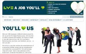
Liverpool Victoria!! (Better known as LV=.)
After spotting news of the Best Online Career Website 2009 Award handed out at the recent Onrec Expo 2009, I zipped right over to the LV= site, and had a really fun visit. It’s quirky without being gimmicky—which is tough to pull off.
Onrec (“The Magazine for Online Recruitment Around the World”) didn’t offer any specifics about their award choice, but here’s my reaction to the LiverpoolVictoria site.
What I loved:
It’s loaded with real people. They do seem to skew toward the extra-attractive, but not so much that it seems staged. And they are identified with first names and titles, so there’s a feeling of authenticity. Nice touch: The people are actually interacting with one another—sharing activities instead of just staring into the camera.
It’s tongue-in-cheek. The banner at the top of the page looks like a bumper sticker, and there’s a continuing theme of lime-green hearts . . . and umbrellas . . . and—well, you just have to see it. In general, there’s not a lot of playfulness on corporate websites, because there’s always a risk that not everyone will “get it,” and it doesn’t wear well for long. (Novelty has to be updated.) But done right, whimsy can be very engaging.
It’s obvious, but not in a boring way. That means you can easily find what you’re looking for (so it’s intuitive), yet you don’t feel the need to rush because wherever you are, there’s something of interest.
What I liked:
This was a total surprise. I usually don’t like sound (music, speech, or otherwise) on a website. But LV= is awash in sound–peppy music, people talking, etc.–and it seems to work. I think that’s mainly because the sound supports the visuals and fits the personality of the company. Plus: You can easily turn it off, so it’s user-friendly.
The basic options are there, in the sense that you can you can easily locate and apply for vacancies, and you can also create a job alert.
What seemed to be missing:
I saw zero social media connection. Although that’s not a deal-breaker, it does imply that the site is a bit behind the curve. It’s interesting that Onrec (which is focused specifically on online recruiting) gave the top award to a site with no Facebook and no Twitter. But on the up side: If LV= hasn’t committed to a social media strategy, at least they are not trying to fake it.
I couldn’t find a link to the main corporate site. That seems odd.
It doesn’t appear you can upload a CV proactively—just for a specific position. However, their description of the employment process (which is clear, helpful and easy to find) indicates that resumes will be compared against all open positions.
That’s the end about LV, but–
Did you notice that the bold words above represent all five vowels? (Leaving out “sometimes W and Y.”) They are borrowed from a nice presentation by Matt Adam, Chief Talent Strategist for NAS Recruitment Communications. Not groundbreaking, but a good summary, plus lots of examples—and the “vowels” offer an easy way to remember some basics of best practice for the Careers website.
Cynthia Giles has followed a serpentine career path from academia to publishing to marketing and design to information technology and corporate communications. There’s plenty of detail about this journey at www.cynthiagiles.com, but briefly--the common theme has been ideas, and how to present them effectively. Along the way, she became an accidental expert on data warehousing and business intelligence, and for the past ten years she has combined corporate contracting with an independent consulting practice that focuses on marketing strategy for smaller businesses and non-profits.
Having spent quite a bit of time looking for work, and anywhere from two weeks to two years inside a wide variety of American companies—she has given much thought to what works (and what doesn’t) when it comes to creating a great employment fit.
