Picking up where the previous post left off, for a new day of sleuthing:
Question 1 . . . Did the companies that flunked Forrester’s 2008 review do anything to improve their Career sites? The Forrester report came out at the beginning of April 2008. I know from previous research that both AIG and Citi redesigned their sites sometime after February of 2008. As noted in Recruiting in the Headlights, they went with very different approaches: sizzle (AIG) and steak (Citi).
The Wayback Machine reveals that the other two financial companies have also redesigned their sites in the past year or so (Goldman Sachs sometime after November 2007 and Merrill Lynch after February 2008). Both stepped up to a bold, clean look on the landing page, with a giant graphic and just a few top-level “gateway” links.
As for the retailers: JCPenney has vamped up its Careers look sometime since the last Wayback capture in mid-2007 (big improvement, though blindingly red); Kroger has freshened up since early 2008 (not a radical change); and Rite Aid has not redesigned at all, just added a few drop shadows.
Now we jump to Question 3—concerning Macy’s—and the plot thickens. This is also a site I’ve looked at before (Communicating the Employer Brand), noting that it didn’t stand up well by comparison to Nordstrom. It appears that the current site design has indeed been upgraded since the Forrester review, and presumably addresses the functional issues highlighted by Forrester.
But this research has revealed an interesting story . . .
Once upon a time, the Macy’s (aka Federated) Career site was an industry darling. Not only did it win the ERE “Best Corporate Careers Website” award in 2005, it was also named by CareerXRoads in their “Top 25 Corporate Websites (PDF)” list, and in 2004 had been cited by ERE as one of “The World’s Very Best Employment Websites.”
Even setting the bar at a pretty ordinary height, I cannot imagine anyone would pick out today’s Federated/Macy’s site as among the world’s best, even if it works well. So—what happened?
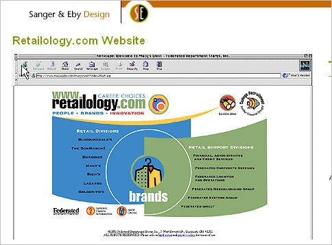
In 1999, Federated launched a college recruiting site called Retailology, which was so successful that in 2001 it was extended to become a branded portal for company-wide recruiting. By September of 2002, according to a story in Internet Retailer, “more than 2.2 million job seekers–an average of 6,253 a day–have visited Retailology. The average visitor session length clocks in at more than a quarter hour, and some 205,000 people have begun the job application process by submitting their information to Federated online through Retailology.com.”
Many of the factors that attracted attention to Retailology have become best practices today—but they were on the leading edge then. For example: detailed job descriptions, real-time postings, career path examples for actual employees, executive profiles, diversity messaging, location highlights, an interactive forum on the college portion of the site, more than 70 employee interviews, and a “Connecting With Our Customer” section sharing “the experiences of exceptional sales and sales support associates,” along with “unedited thoughts and experiences directly from Federated customers.”
On top of all that, the site had an unconventional, fashion-oriented look:

We can probably agree that the Retailology design was outdated by 2007, and no doubt needed a makeover.
 But the design that replaced it (in June of that year) was not a creative update—more of a 180 turn from fun to serious, from fashion to business.
Much of that best-practice functionality was still in place, but the look-and-feel was decidedly different.
The 2007 version was probably the one reviewed by Forrester.
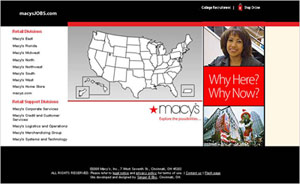
Sometime in 2008 the site underwent a design polish, and—fast forward—here’s what you see today:
What drove the shift–and whether it pays off–are questions that can’t be answered from the outside. But I would love to hear opinions, insights, or information regarding Macy’s apparent decision to fit in rather than stand out.
And in the meantime (in case you were keeping up!) I promise to illuminate the remaining mystery of Question 2 in a future post.
Lucy is Editor at Corporate Eye
