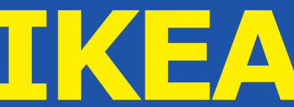
Over the past few weeks, IKEA has been challenged from multiple directions over its new logo — specifically, the font change in its new logo design. Remember the old IKEA logo that used the serif Futura font (check it out below)?

Now take a look at the new IKEA logo with the sans-serif Verdana font (check it out below).

Apparently, this font change has caused an uproar with 3,000 consumers signing a position against the new logo and USA Today and the New York Times writing about it. Is this font change really so bad?
Here are my thoughts:
First, the Futura font in the old logo did look very outdated, I can’t argue with that. But does the new logo solve that problem? Designers attack the logo saying Verdana was created to be used in small point sizes (and it’s easy to read in online text), not on massive signage (read more designer reactions here). I can see why that was the intention of the font as even the larger size of the logo shown above with the tight kerning of the last three letters (but not the first — how strange) is a bit ‘cluttered’.
The biggest concern among designers related to the new IKEA logo is the lack of creativity. I’ll admit, when I first looked at the new logo, the first thought that popped into my mind was, “they might as well have just used Arial or Helvetica.” And that’s coming from a person who prefers simple logos to complex logos.
So what’s the message conveyed by the new IKEA logo? If you ask designers, the message is “our furniture is cheap and so is our logo.” Do you agree?
Susan Gunelius is the author of 10 marketing, social media, branding, copywriting, and technology books, and she is President & CEO of KeySplash Creative, Inc., a marketing communications company. She also owns Women on Business, an award-wining blog for business women. She is a featured columnist for Entrepreneur.com and Forbes.com, and her marketing-related articles have appeared on websites such as MSNBC.com, BusinessWeek.com, TodayShow.com, and more.
She has over 20 years of experience in the marketing field having spent the first decade of her career directing marketing programs for some of the largest companies in the world, including divisions of AT&T and HSBC. Today, her clients include large and small companies around the world and household brands like Citigroup, Cox Communications, Intuit, and more. Susan is frequently interviewed about marketing and branding by television, radio, print, and online media organizations, and she speaks about these topics at events around the world. You can connect with her on Twitter, Facebook, LinkedIn, or Google+.
Hi Susan,
I’ve seen this story picked up in a few places too. I understand that the font change was to create a logo in a ‘web-friendly’ font. I think this is to allow the brand to be consistent across print and online communications using an accessible font, although knowing more about the reasons behind the decision would be really interesting.