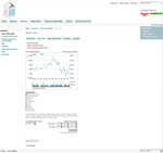
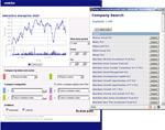
Ever wondered what everyone else was using to chart their share price? Here are eight different ways of charting the share price.
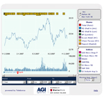 Many if not most FTSE 100 companies now provide interactive share charting facilities, so that visitors can see the trend over the last day, week, month … or whatever period interests them.
Some companies provide the option to compare the performance of their stock with indices and sector – perhaps the FTSE or equivalent, or a set of related companies.
A subset of these companies make it easy to compare their own performance with that of their direct competition. For example, Roche make it easy to see how they are doing compared to Bayer, or Pfizer, GSK or AstraZeneca (among several others).
A very few companies make it easy to compare their performance against apparently any listed company.
Doing this isn’t necessarily best practice – after all, your performance may not be up to scratch for some reason, and you might not want to highlight this. However, showing your performance against your competitors is a sign of confidence – and demonstrates transparency.
Examples of share price charts:
- No chart. Vedanta Resources and United Utilities are two companies who don’t offer any share price charting (on their own site – Vedanta does have a link to the LSE site for charting).
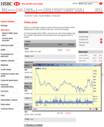
- Static chart. HSBC has a static chart: that is, there is no opportunity for the visitor to change the data on which the chart is based. Many companies have a static chart visible with the share price on the home page or investor landing page; most, though, have an interactive chart available in the detail pages
 HSBC
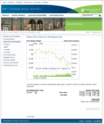
HSBC - Charting by date alone. Persimmon allow the visitor to chart against different dates only. No comparison against indices or competitors is possible.
 Persimmon
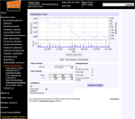
 - Charting against indices. As well as allowing flexibility about the time period covered, Punch Taverns allow charting against indices only, (up to three indices and one sector) as do Enterprise Inns and ITV.
Note that there is something broken about the layout of the selection boxes …
 Punch Taverns
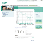
 - Charting against limited indices and preselected companies. Sage enables the visitor to choose their own dates to chart, and offers a mix of indices and competitors, but with a very limited range
 Sage
Sage - Charting against companies alone. Home Retail Group offers a wider range of comparators (up to 10) from which to choose any permutation to graph, as well as the opportunity to select a custom period over which to chart.
 Home Retail Group
 - Charting against a wide range of indices and preselected companies. ENI offers a wide range of comparators and a wide range of indices to choose from as well as custom date ranges.
 ENI
ENI - Charting against indices and a wide range of companies. Centrica allow charting against only one index and one sector at a time, but provide an extraordinarily wide range of potential comparators to choose from, and flexible date selection. Simply enter the first letter or two of the company name and select Search to be presented with a list of options.
 Centrica
One of these should be suitable for your organisation … combined with the option of adding links to the press releases and other events you should be able to provide what your investor needs.
Footnote:
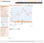
Incidentally, I note that the Reed Elsevier chart is broken in Firefox. I’ve said this before: please make sure everything works in Firefox. Here it is in Internet Explorer 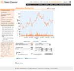
Do you see how the date comparison options have disappeared behind the chart?
Lucy is Editor at Corporate Eye
