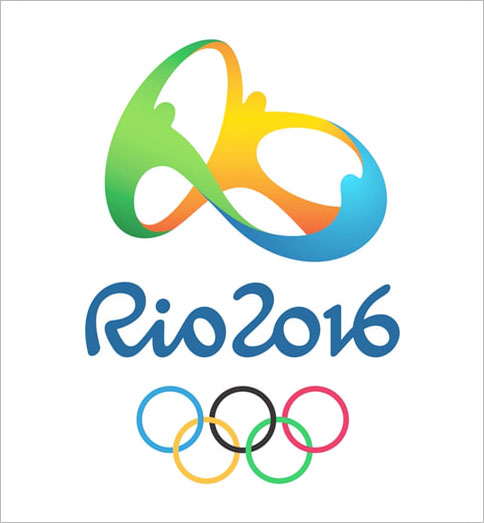
 The logo for the 2016 Olympic Games in Rio was unveiled over a year ago, but it’s back in the news following the 2012 Games in London. Unlike the buzz around the London Olympic Games logo that was primarily negative (I wrote about it not once but twice in 2007), the buzz around the Rio 2016 logo has been fairly positive lately.
First, the logo was created not for $800,000 as the London 2012 logo was, but rather as a result of a contest which was won by Brazil’s Tatil Design. Second, the logo is less psychedelic than the London 2012 logo, which the Epilepsy Action group claimed made people physically ill and which the Daily Mail invited anyone and everyone to redesign. Instead, the Rio 2016 logo is more human and provides the “touchy-feely” look that people expect from the inspirational Olympic Games.
Tatil Design created a video that you can watch below, which describes the creative process used to develop the 2016 Olympic Games in Rio logo. The agency created over 150 logos using a highly collective process in keeping with the Games. They wanted to create a logo that was technical, emotional, innovative, recognizable, related to Brazil, and human. To that end, the team created a new typography to give a personality to the word “Rio” within the logo design and make it more human. They also created a logo that can transform. For example, spinning the three-dimensional logo reveals hidden elements such as the Sugarloaf, Rio’s top attraction. Rotated another way, the 3D logo spells out Rio. Furthermore, the logo is intended to be viewed in motion. If one character is removed, the others fall.
While the image of people embracing and dancing isn’t groundbreaking, the Rio 2016 logo is an improvement over the London 2012 logo. It’s also more interesting than the Sochi 2014 logo, which focuses more on the digital Olympics message than the spirit of the Games. What do you think?
Lucy is Editor at Corporate Eye


