Ivory soap debuted in 1879 as an American soap to compete against expensive, luxury soaps from Europe. For nearly a century, Ivory soap has used a tagline (in one variation or another) that identifies Ivory as 99.44% pure — so pure, it floats! A logo refresh, new package design, and ad campaign created by Wieden+Kennedy, was intended to reinforce consumers’ focus on the pure message in a clean and simple way.
First up, the new logo is certainly simple as you can see in the image below. Honestly, it seems too generic, but where this brand refresh shines is in the advertising creative.

According to the description of the brand refresh on the Wieden+Kennedy website:
“The inspiration for this campaign came from the observation of how, over the years, in an effort to make life simpler, we have somehow made life more complicated. Taking a humorous look at what are called “Ivoryisms” – these honest truths include a series of simple and straightforward messages that reintroduce Ivory’s perspective on keeping things clean and simple.”
You can see some of those “Ivoryisms” in the print ad samples below.
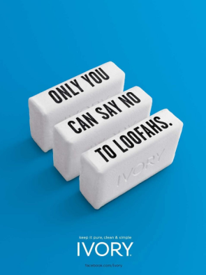
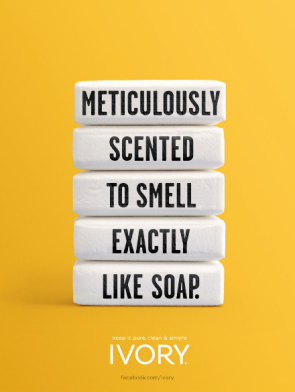
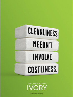
 These bold and simple messages are excellent. They capture people’s attention and represent things people can relate directly to in their own lives. There is no doubt that the “loofah” ad above will strike a chord with a specific target market (for example, men). Another hits people where it counts — their wallets, and a third is likely to resonate with audiences who don’t like overly-fragrant soaps that smell like perfumes.
The video element of the advertising campaign is equally simple. Again, the Ivoryisms take center stage with no visual distractions or cluttered messaging. Two samples are included below.
Focused brands are powerful brands, so it makes sense that Ivory would contract its brand focus to its original brand promise of purity. That clean and simple message says it all, and in today’s overflowing soap aisle at the supermarket, a pure, clean, and simple soap is just what many customers are looking for.
What do you think of the Ivory brand refresh?
Images: WK.com

 Things aren’t looking good for Research in Motion (RIM) as far as the smartphone market is concerned. Recently, comScore released data related to the
  On October 24, 2011, a former New York Times employee and manager of that company’s 3-year old “Motherlode” blog launched a new blog for her new employer, AOL’s The Huffington Post, called “Parentlode.”

 Just a few months ago, Google kicked brands, businesses, bands, and other non-personal profiles off of Google+ with a message that they’d be welcome back soon with something specifically created for them. That day has come.