- Not A Royal Wedding PostYou didn’t think you’d get away without a Royal Wedding post, did you? Anyone who’s spent any part of the last couple of weeks awake, here in the UK, is well aware that a young couple are getting married today. It is rare that an event is of such significance that the entire country is […]

- Corporate Websites and the Opportunity to EducateA guest contribution provided by Forex Traders In today’s fast paced electronic age, corporate communications executives have expanded their distribution options immensely, but with broader spheres of influence, the message at times gets diluted, and the intended goals of the message may sometimes miss their mark. Each audience of stakeholders and potential supporters varies from […]

- Social Media in a Corporate ContextIt’s that time again… Long-standing readers will remember that I’m a fan of the Social Media in a Corporate Context conferences organised by Communicate – and have been to several of the UK-based ones. The next one is coming up on June 2, in London, at The Grange St Paul’s Hotel (between St Paul’s Cathedral […]

- Cashing in on the Royal Wedding – 5 Bizzare Royal Wedding Merchandise OptionsBack in November 2010 when Prince William and Kate Middleton announced their engagement, analysts quickly spoke up about the money the royal wedding could bring to the U.K. retail sector. Early estimates predicted that royal wedding-related merchandise revenue could reach more than $40 million. Now, the Royal Wedding is upon us and merchandise with Prince […]

- How to deal with setbacks in your corporate communicationsI invited Graham Price, a psychologist and executive coach, to write a post for us about dealing with setbacks. Of course, this isn’t only relevant to corporate communications, but to all aspects of life… A newsletter has gone out with a glaring, and rather embarrassing, error. Someone has decided to set the cat among the […]

2011 Logo Design Trends
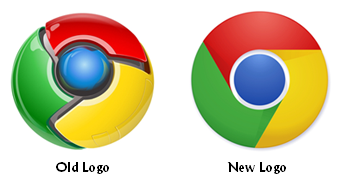 Each year, the team at LogoLounge.com puts together a logo design trend report. The 2011 logo trends were released this week, and it appears we’re in for more of the same in terms of color, circles, and bursts. In fact, most of the trends for the current year are disappointingly unexciting.
The report includes a variety of design trends. I pulled several of the most interesting trends from the report. They are:
- Retro-chic: The Web 2.0 look is fading in popularity as many brands (such as the Google Chrome logo pictured above) return to the 2-dimensional logo design that worked in the past.
- Skinny is in: Thin lines in design and type are all the rage in 2011.
- Gradients: Having worked for a company with a gradient in its logo in the past, this is a design I strongly dislike, but alas, it’s in for 2011.
- Cartoons: Cute, cartoon-like illustrations are being used more and more in logo designs.
- Brown: There was a time when brown was a very unpopular color for logos and brand color palettes, but that’s not the case this year.
It seems like we’re in a slump as far as brand identity and logo design creativity are concerned. Companies appear to be afraid to go against the status quo and designers are surely frustrated. It’s hard to curb the creative spirit!
Of course, the ultimate test of a good logo is whether or not it works in black and white. If your logo doesn’t pass the one-color test, then you need to go back to the drawing board.
And here’s a final thought — in January 2010, I wrote a post here on the Corporate Eye blog about the Brand New blog’s most relevant brand identity work of the decade (2000-2009) wrap-up. Follow the preceding link and take a moment and scroll through that wrap-up. Then compare what you read to the 2011 logo design trends. You’d be surprised to learn how much logo design really hasn’t changed. There are some recent logos that stand out as particularly innovative, appropriate, and effective, but most use more of the same tried-and-true techniques that have been used for decades.
What do you think? Are companies afraid to take their logo designs too far outside the box? Leave a comment and share your opinion.
Not A Royal Wedding Post
You didn’t think you’d get away without a Royal Wedding post, did you?
 Anyone who’s spent any part of the last couple of weeks awake, here in the UK, is well aware that a young couple are getting married today.
It is rare that an event is of such significance that the entire country is aware of it, whether enthusiastic about it or not. So it’s not surprising that media channels are making the most of it, whether or not the wedding will provide a boost to our economy – and retail companies, at least, are hoping that it might provide them with a short-term boost…
No doubt you’ll have communicated with your employees about the wedding, and possibly also with customers.
But should you take any notice of this kind of event on the corporate website? If there’s no apparent relevance to your company, then it might well seem inappropriate – even opportunistic. Though making over a home page for the day in celebration can be a nice touch; it’ll be interesting to see if anyone has done this.
There are examples of corporate websites making reference to national events, and doing it well:
- Regular readers may remember that I commented on BAE Systems highlighting National Apprentice Week on its home page recently. While this event didn’t generate as much national enthusiasm as “The Wedding”, it was nevertheless directly relevant to BAE Systems and their recruitment activities.
- Another example is that of Rio Tinto, who have a link from their home page to a section about the 2012 Olympics (which will be hosted here in the UK). Relevant? Yes: Rio Tinto are providing the metal to produce the 4,700 gold, silver and bronze medals.
- Rio Tinto aren’t the only supplier to the London 2012 Games: G4S also discuss their role in providing security for the Games on their corporate website (and I expect that several of the other official suppliers do something similar).
These examples are directly relevant to the activity of the company, and – in terms of site content – are similar to case studies or testimonials. It’s just that they are quite high profile ones.
There are of course many examples of sponsorship by companies of various different events, individuals or activities, often because of a perceived alignment with the corporate brand (Catlin and the Arctic Survey; Investec and the Derby; Volvo and the Gothenburg Symphony Orchestra….). This type of site content is also promotional, though often companies aim to associate it with their social responsibility activities.
Both these kinds of promotion have their place on the corporate site.
Royal wedding? Perhaps not so obviously relevant to a corporate site unless you are providing a product or service… in which case you’re probably sworn to secrecy until the weekend anyway.
Corporate Websites and the Opportunity to Educate
A guest contribution provided by Forex Traders
 In today’s fast paced electronic age, corporate communications executives have expanded their distribution options immensely, but with broader spheres of influence, the message at times gets diluted, and the intended goals of the message may sometimes miss their mark. Each audience of stakeholders and potential supporters varies from the mean in their requisite ability to both understand and fully comprehend the import of what is being communicated.
The opportunity to influence is fleeting, and care must be given to transmit the three qualities of coherence, clarity, and ethics to each stakeholder. The essential goals of effective corporate communications have been laid down in the literature on the topic as simply:
“The set of activities involved in managing and orchestrating all internal and external communications aimed at creating favorable starting points with stakeholders on which the company depends, consisting of the dissemination of information by a variety of specialists and generalists in an organization, with the common goal of enhancing the organization’s ability to retain its license to operate.”
Simple and straightforward advice, and when this wisdom is combined with the fact that 80% of all communication has been demonstrated to be nonverbal, the need for greater attention paid to the remainder becomes all the more apparent. With social communication, we have eye-to-eye contact and the ability to observe the reactions of our audience, whether good or indifferent, to whatever we deliver. We also have the opportunity to explain further a point that may appear misrepresented or confusing in the words that we have chosen. With written messages, much of this feedback mechanism is nonexistent.
The corporate website is a perfect example of where greater care can be exerted to ensure that all readers that access this valuable tool can leave with a more than favorable experience. However, there is also what is known as the ‘network effect’ that posits that, as the number of people grows in a ‘conversation’, the propensity for miscommunication grows multiples more quickly than the ability to communicate effectively on a direct basis. Webmasters need to think like demanding editors before loading whatever new item comes down the pipe.
The more complex the subject matter, the more attention must be paid. A case in point, is the common ‘Investors’ tab on websites of publicly traded companies. The financial information is often presented as if in compliance with an accounting or legal standard in mind, when the visitor may not be educated in the nuances of financial statement presentations or in the ability to interpret something as simple as a share value chart over time. In the classroom, it is known as a ‘teaching moment’. Elect to educate when the timing is right. For example, if an abbreviation as succinct as “EUR USD” is presented, one must note that the symbols are common substitutes for the Euro and U.S. Dollar from a currency perspective. Not everyone is aware of this subtlety.
Website designers have learned the importance of focusing on the user experience and not letting the design components interfere with that experience. Content must apply to the user’s specific needs, whatever the audience demographics might entail, and allow for feedback to gauge the effectiveness of the message. Keep it clear and simple, and repeat where emphasis seems appropriate. Consistency is the expectation, and timeliness of information impacts credibility. Be sure to review and purge what is no longer topical or on message.
As organizations expand in number of employees, the ability to communicate effectively diminishes proportionately. Website communication standards are key to ensuring that quality is “Job One”.
Social Media in a Corporate Context
Long-standing readers will remember that I’m a fan of the Social Media in a Corporate Context conferences organised by Communicate – and have been to several of the UK-based ones. The next one is coming up on June 2, in London, at The Grange St Paul’s Hotel (between St Paul’s Cathedral and the Millennium Bridge)
The programme seems to get stronger every time. Though the programme this year offers case studies in multiple stakeholder areas – investor relations and corporate social responsibility, for instance – and a panel discussion of crisis management, it also focuses on considering some of the ‘meta’ aspects of social media in a corporate context:
- regulation by the ASA – and a case study on influencing other regulators
- relationship between social media and the business strategy
- using social media on extended platforms and technologies
- and the future of social media.
Last year, highlights for me were:
- discussion of SEO, story-telling, and the relationship between journalists and corporate comms at the October conference
- discussion of social media newsrooms during the April conference.
This year? I’m looking forward to finding out. Speakers come from a wide range of companies, including TalkTalk, Tata, BBC, Microsoft, Pepsi, Unilever, Visa…
Book now: there’s a discount available for friends of Corporate Eye. That’s you!
Cashing in on the Royal Wedding – 5 Bizarre Royal Wedding Merchandise Options
Back in November 2010 when Prince William and Kate Middleton announced their engagement, analysts quickly spoke up about the money the royal wedding could bring to the U.K. retail sector. Early estimates predicted that royal wedding-related merchandise revenue could reach more than $40 million.
Now, the Royal Wedding is upon us and merchandise with Prince William and Kate Middleton imagery or related messaging is flooding the market. Following are some particularly creative (i.e., strange) products featuring the future king and queen’s likenesses:
Beer

One bottle of the special Royal Virility Performance Beer from Britain’s BrewDog brewery contains one-third of the amount of a prescription Viagra dosage. If that’s not enough to get your libido going, Royal Virility Performance Beer also includes chocolate and Horny Goat Weed–two ingredients known for their aphrodisiac powers.
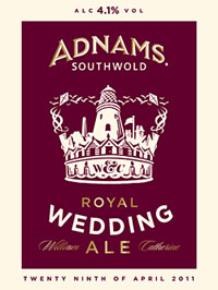
Don’t worry. If you don’t need a Viagra boost, there could still be a Royal Wedding-related beer for you such as Adnams Royal Wedding Ale which lists honey as a key ingredient (according to the Adnams website, honey beers have been used to celebrate weddings for years–hence the term “honeymoon”).
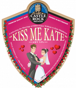
Another option, Kiss Me Kate, comes from England’s Castle Rock Brewery.
Condoms
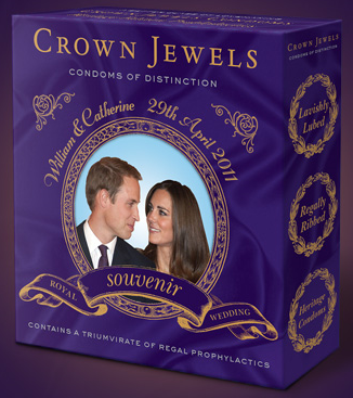
Crown Jewels aren’t just any condoms. As the tagline says, these are “condoms of distinction.” These condoms come in a souvenir heirloom collector’s box and include a collectible portrait of the royal couple.
Sick Bags
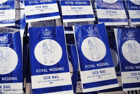
Royal Wedding not your thing? Feeling ill from all the media attention? Try the Throne Up Royal Wedding Sick Bags — available in red or blue.
Toilet Seat Covers
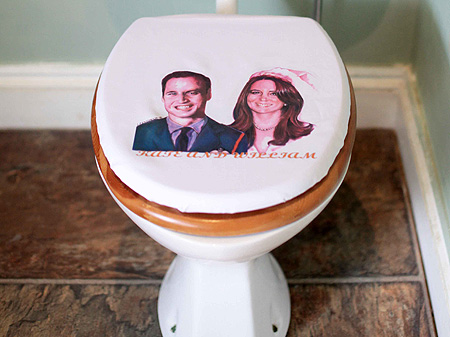
So the Royal Couple can be with you at all times, try the Royal Wedding commemorative toilet seat cover!
Refrigerator
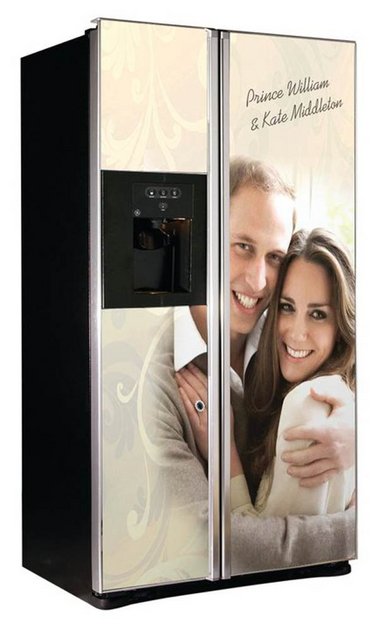
You can break away from the royal nuptials for a snack and still see the Royal Couple’s smiling faces in gigantic size on your refrigerator doors with the GE/GDHA royal refrigerator.
I guess it’s not surprising that the Lord Chamberlain’s office issued guidelines for Royal Wedding merchandise in December. The Royal Wedding is big bucks and retailers aren’t going to miss their chance to cash in.
What’s your favorite Royal Wedding merchandise? Leave a comment and share your thoughts.
