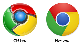
 Each year, the team at LogoLounge.com puts together a logo design trend report. The 2011 logo trends were released this week, and it appears we’re in for more of the same in terms of color, circles, and bursts. In fact, most of the trends for the current year are disappointingly unexciting.
The report includes a variety of design trends. I pulled several of the most interesting trends from the report. They are:
- Retro-chic: The Web 2.0 look is fading in popularity as many brands (such as the Google Chrome logo pictured above) return to the 2-dimensional logo design that worked in the past.
- Skinny is in: Thin lines in design and type are all the rage in 2011.
- Gradients: Having worked for a company with a gradient in its logo in the past, this is a design I strongly dislike, but alas, it’s in for 2011.
- Cartoons: Cute, cartoon-like illustrations are being used more and more in logo designs.
- Brown: There was a time when brown was a very unpopular color for logos and brand color palettes, but that’s not the case this year.
It seems like we’re in a slump as far as brand identity and logo design creativity are concerned. Companies appear to be afraid to go against the status quo and designers are surely frustrated. It’s hard to curb the creative spirit!
Of course, the ultimate test of a good logo is whether or not it works in black and white. If your logo doesn’t pass the one-color test, then you need to go back to the drawing board.
And here’s a final thought — in January 2010, I wrote a post here on the Corporate Eye blog about the Brand New blog’s most relevant brand identity work of the decade (2000-2009) wrap-up. Follow the preceding link and take a moment and scroll through that wrap-up. Then compare what you read to the 2011 logo design trends. You’d be surprised to learn how much logo design really hasn’t changed. There are some recent logos that stand out as particularly innovative, appropriate, and effective, but most use more of the same tried-and-true techniques that have been used for decades.
What do you think? Are companies afraid to take their logo designs too far outside the box? Leave a comment and share your opinion.
Lucy is Editor at Corporate Eye


I prefer the less bubbly, flatter form. I was waiting for that the fade. I also must say that I prefer the brown palettes in identity design as well. Thanks for the tips, I was unaware of the “cartoony” iconography making a return.
I still like the previous logo of chrome better because it stands up for its name chrome. The design “was chromey,” is that a word? Lol. But it’s all good since everyone need a change at some time.
I agree with “If your logo doesn’t pass the one-color test, then you need to go back to the drawing board.”
we can’t change the body frame but we can make better body with fitness NOT with expensive colourful cosmetic and clothes.
Thanks for sharing owsome your owsome idea!