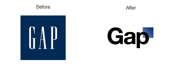
Last week, I published a post here on Corporate Eye about the debate over the new Gap logo. This week, Gap is taking a new step to put out the controversial fire that the new logo started. Exactly one week after the new logo debuted on the Gap website, the company announced that the old Gap logo is back!

The new Gap logo was going to roll out in stores in November 2011, but that plan has been stopped. The old Gap logo is returning to the Gap website, and the company has pulled its “crowd-sourcing” project that was originally launched to quiet the online debate about the new logo. That project would have allowed consumers to offer new logo suggestions and ultimately choose the new Gap logo.
Interestingly, Gap’s latest steps to stop the controversy have been met in part with a new controversy. Now, the question being asked among with social Web community is whether or not the new Gap logo was nothing more than a publicity stunt. The controversy has even been dubbed Gap-gate.
It’s fairly safe to make the blanket statement that people like their constants, and the tangible symbols of brands people are comfortable with, such as the Gap logo, make them feel secure. There are few logo redesigns for well-known brands that have been around with the same logo for a long time that roll out to a standing ovation and happy consumers everywhere. However, the social Web conversation makes it a lot easier for companies to hear and follow those negative reactions.
The question is whether or not companies should move forward despite those conversations or if it’s right to listen to those conversations and keep the security blanket as Tropicana did with its packaging not long ago and as Gap is doing now with its logo. Undoubtedly, the logo redesign was a multi-million dollar investment, and reverting to the old logo equates to a significant financial loss for Gap company. One can assume that if the logo was expected to roll out in retail stores next month, signage was already being printed, retail bags were being produced, ads were being developed, and so on. That’s all lost money.
So the question for brand managers is actually this:
Should companies react so strongly to the online conversation as Gap has done or should companies rely on the expertise of their staff and continue moving forward with the hope that consumers will ultimately accept changes as they get used to them?
Of course, the new Gap logo wasn’t revolutionary. Perhaps if the design were outstanding, it would be easier to defend it to consumers. But what if the design truly is a good one and consumers speak out against it in the online, global conversation? It happened to a lesser degree with the new Walmart logo that was introduced in 2008, but Walmart moved forward despite the negative buzz.
What do you think? Leave a comment and share your thoughts.
 An interesting sea change has caught my eye over the past 12 months : the stricter regulation of green advertising.

 It’s the hoary old chestnut : what exactly does CSR mean to you?