SKF is one of the leading global suppliers of products, solutions and services within rolling bearings, seals, mechatronics, services and lubrication systems.
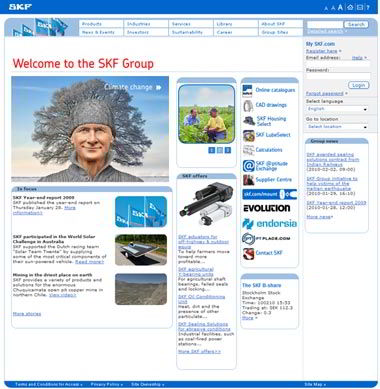
Industrial products – so I expected a more serious corporate website without the “bells and whistles” you see on consumer products and services companies.
Right? Well, not entirely… The company has a video and some interactive items on the homepage, and there are plenty more “bells and whistles” elsewhere. Plus, they do a good job of integrating product information with corporate material here (not always easy).
But the real story is how they present the company.
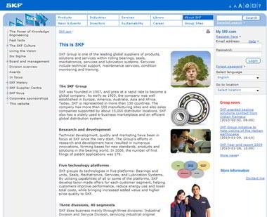
First, the About Us section is called This Is SKF. This is only a portion of the page — the company offers too much information to display in one image.
So let’s see the menu on this page:
- The Power of Knowledge Engineering
- Fast facts
- The SKF Culture
- Living the Vision
- Six Sigma
- Board and management
- Division overview
- Awards
- In focus
- SKF History
- SKF Supplier Centre
- SKF Nova
- Corporate sponsorships
- This website
Pretty comprehensive, and there are bells and whistles all over the place: see Living the Vision and the Power of Knowledge Engineering, and do go to look at the history timeline. The In Focus section has loads of information about the various components of the company (very interesting). And “This website” is something I have never seen on a corporate website: it describes the organization of the website. Much better than a site map.
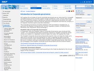
Next a visit to Corporate Governance.
The theme of rich content continues here but, unlike other sections, there is too much use of PDFs rather than online sources for my taste.
Suggestion for SKF–apply your overall content strategy in the Corporate Governance section as well as elsewhere.
Despite this minor quibble, SKF’s website is content rich for stakeholders.
Something for everyone…


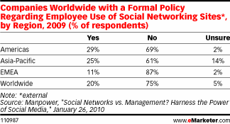 Gartner also predicts that companies will become more open to employees using both business and personal social networks for business purposes, but with that change in policy will come the need for companies to create specific guidelines for use. According to a study by Manpower (via