I love the Brand New blog for its insightful critique of brand identity work. If you love branding and haven’t checked that blog out yet, then I highly recommend that you visit. This week, Armin from the Brand New blog published a recap of the most relevant identity work of the decade. It includes commentary about some of the most interesting identity work unveiled during each year of the first decade of the 21st century.
Here are a few of my favorites:

Cingular — 2000
I miss this logo. I loved how it was cleverly used in a variety of way to give the brand a personality.

Obama — 2007
The Barack Obama campaign identity was brilliantly put together by Sender LLC and will undoubtedly become the standard for future political campaign branding efforts. You can read more about the Obama brand strategy here.

Walmart — 2008
I’m still not in love with the little yellow burst, but I think Walmart has integrated it into its identity well. The best part of the new Walmart identity, which was unveiled in 2008, is the omission of the dreaded hyphen that used to plague the Walmart name. I was thrilled to see that hyphen go!

Tropicana — 2008
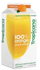
Sometimes ‘relevant’ can be negative, and Tropicana’s brand identity faux pas brought us exactly that in 2009. The lesson to learn from the Tropicana packaging mistake is this — don’t fix it if it’s not broken and do NOT replace a solid identity with a Plain Jane, generic package design.
Be sure to check out the entire decade identity recap on the Brand New blog. What brand identity stories of the past decade resonated with you? What are the most important lessons you learned from other identity work during the past ten years? Leave a comment and share your thoughts!
 How to effectively use
 According to a
