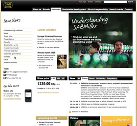
A good investor home page is like a good beer – it satisfies an immediate need. Judged by that standard, the investor home page for SABMiller qualifies quite well. I found the page well laid out, with main topics running down the left hand side and latest updates, share price and News in the middle, pretty much where I would go looking for them. The color palette and design were quite sober, perhaps by design, as, well… this is a beer company.
I particularly liked the fact that the main topics included a glossary, as many companies have acronyms and specialized jargon that often wind up sprinkled throughout their disclosures. Unfortunately, when you go to the SABMiller’s Glossary, what you find is a basic financial terms glossary, with definitions of such things as “Bear market” and “Mutual fund”. It reads as if it was lifted straight from a third party provider as it has no definitions that are specific to SABMiller. For example, definitions for the difference between a brewery and a bottling plant would be much more helpful than learning about bear markets. (After the last few months, most of us know all too well about those…) SABMiller should think about putting something here that is directly relevant to their business.
My only other comment about the investor home page is one I’ve made about other investor pages as well: The listing of topics running along the left hand side would be greatly enhanced if it featured pop-up lists as you scrolled over the section. This would allow investors to find what they want more quickly, without the hassle of hunting through all of the sections.
Overall, a good Investor home page, although the issue with the Glossary grates. Perhaps my expectations were too high, but it’s enough to make me want to go have a beer.


