Running an investor relations website is complicated enough. Ensuring that data is posted in a timely manner, but not too early so as to upstage a presentation, or worse, drop into a regulatory spider web of sticky questions regarding public and non-public disclosure. All while keeping both management and shareholders happy and informed.
In the past, we’ve looked at how investor relations provides information for employee shareholders, as well as the need to provide useful investing data to retail shareholders or private shareholders, and of course, no one can forget about institutional shareholders. But, just how does an IR team go about getting all of that information displayed in a compelling and appealing manner on the investor section of a website?
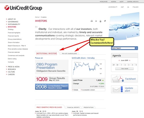
One intriguing idea is being used by UniCredit Group. UniCredit Group has what at first glance appears to be a common enough investor’s landing page. However, in the middle of the page are two tabs, one labeled “Institutional Investors” and the other labeled “Private Shareholders.”
Such a layout acknowledges the difference in the type of data and information each audience might want to see. At the current time it appears to be more of an experiment or a placeholder for a grander future divergence of information considering that one entire half of the Institutional tab’s display is taken up by a share price graph, data any institutional investor will no doubt have in much more detail at their fingertips.
Also, all of the publications, data, and documents displayed in the center tabbed area are also easily accessible via more standard menus. However, what makes the concept so compelling is its ability to highlight specific information based upon the target audience.
For example, a company in the middle of a press storm regarding a trivial matter being blown out of proportion by the media will find much more value in responding to private retail shareholders who may be concerned by what appear to be damaging press accounts, while more savvy institutional investors may be more likely to recognize the issue as nothing more than the whole lot of noise it is.
In this instance, the company could find much more value in highlighting a recent symposium or trade group presentation to the institutional audience instead of having to choose between risking appearing like they are burying the response to the “big news story” or risking that the well received presentation gets missed beneath what institutional investors would recognize as the rote response to a saucy but meatless news story.
Improving on a Good Idea
While UniCredit Group’s center located tabbed division is a clever solution to a tricky problem, one can’t help but imagine even better implementations of a similar concept.
An investor relations page that highlighted the appropriate tab by default for either registered users, recognized by their login information, or even just previous users, recognized by cookies set in the browser based upon which information was accessed on their last visit.
Indeed, one might expand the number of tabs to include not just retail investors and institutional investors, but also employee shareholders, or direct stock purchasers, or participants in DRIP offerings. Numerous scenarios can be envisioned under which each of the groups has as their primary concern a different issue, and the tabs can help ensure that the issue deemed important by each group is readily addressed.
Likewise, there would also be many instances in which the key concern of the day would be the same among all groups. With the tabs already in place, duplicating the same information to each tab would be a minimal effort, and despite the fact that all of the tabs have the same basic data posted on each of them, each shareholder would still feel that they were looking at information targeted specifically toward them.
Investor Relations Website Best Practices
As always, the objective is not to determine which pieces add up to the “best” investor relations webpages, but rather to develop and understand techniques and tactics which can aid in the ultimate goal of an IR department which is the timely and accurate dissemination of information and data to shareholders. The tabbed concept would not be right for all IR groups, but could provide a boon for those looking for way in which to get more into less room.
Additionally, whether using tabs or not, the easy to see split between types of shareholders conveys the impression that all investors regardless of type are important and that the IR department will ensure that users receive tailored information regardless of who they are or how much they will be investing.
And, when you make investors feel like they are cared about by competent and responsive company representatives, you have already gone a long way toward making them feel like your company might be one they would want to be stockholders in.

 The story that’s been traveling through online branding circles over the past several days has centered around the upgraded headlights in Toyota’s eco-friendly Prius model and their tendency to fail, particularly after the car’s warranty is over. At first glance, this story might not seem like a big deal. So the headlight goes out. Head over to the local auto parts store and pick up a new bulb. But wait a minute! These are not just any headlights. These are special upgrade headlights that cost up to $1800 to repair and replace when they go out. Suffice it to say, a class action lawsuit has been filed against Toyota over these $1800 headlights.
 Apple is facing a problem that is certainly not new to the world of branding and international trademarking. There are over one billion people in China, and many of them desperately want an iPhone (rumor has it that over 1 million Chinese consumers already own one having gotten them through unofficial channels – via


