I’ve been looking at a lot of sites lately, and have come across several items that don’t need a whole post, and don’t fit anywhere else either. So thought I’d round up a few examples of small things that can make a big difference.
Message: Job-seekers Welcome
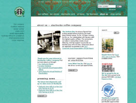
Starbucks hangs out the Welcome sign by putting a Careers link in the exact middle of its About page. The prominent placement indicates that jobs/people are central to the company.
QuikTrip highlights the Jobs tab on its top menu with a red circle and the note ‘Excellent.’ This double-duty detail not only makes Jobs seem important—it also delivers a one-word message that sets up positive expectations.

Message: We’re Serious
Qualcomm offers a substantive three-minute video in which the CEO talks about the importance of employees in the company’s success. The presentation signals visitors that filling jobs at Qualcomm is not just an agenda item for HR—it’s a top-down priority.

Message: We’re on Your Side
Another nice Qualcomm touch is introducing the visitor to some recruiters. Every recruiter profile includes a photo, plus interview tips and the recruiter’s own insights about the company. The effect is not only a feeling of personal relationship, but also an impression that Qualcomm wants job-seekers to succeed. (One criticism: This nifty feature is buried behind an Employee Profiles link. I think it deserves a spot on the top page!)

Boston Consulting Group takes the on-your-side message even further with an Interview Prep section that is extremely cool. In fact, it’s so cool I’ll talk more about it in a future post. Preview: BCG has come up with a simulation that really works. But even if this prep feature were just a few bullet points or an ordinary Q&A, it would still send a strong signal of support to the job-seeker.
Message: Let’s Connect

NetApp puts a contact invitation prominently at the top of each page on the Careers site. While ‘call right now’ is not a feasible strategy for every company–someone has to be at the other end of the phone!–an invitation of some kind (search jobs, send resume, download fact sheet, etc.) gives visitors the opportunity to make an active connection with the company.
Reminder
Details are important. If the major elements—core message, look-and-feel, content items—of a site are strong, the minor elements can add a valuable extra dimension. And sometimes it’s the little things that make the visitor feel important, or distinguish your site from a competitor’s, or help synch the Careers message with the company’s brand focus. So take a look at your site and see if there’s room for improvement at the detail level.

 There is no doubt that online video is the next big trend in online marketing and branding. Statistics from