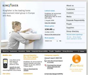
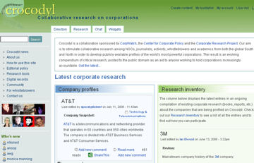
It’s always good to start at the beginning. As I’ve been asked to cast a critical eye over investor relations web sites, I thought the logical place to start might be to see how easy it is to actually get to the investor relations page from a company’s home page. There are several reasons for this. First, how accessible a company makes their information for investors might be a good indication of how they view their obligations to shareholders. Second, it might also tell you how technologically savvy the companies are. Third, you might also get some insight into the company itself. All this may be a bit much to ask of simple placement of the Investor Relations tab on a web page, but I think there’s some validity to it.
I don’t pretend to be an expert in web page design, but I spend a lot of time staring at web sites to get information, so I know what I like. I’m in agreement with a general rule in web site design that I’ve heard bandied about, which is the “Two click rule”. That is, if people can’t find what they want within two clicks on your web site, they start to get frustrated and leave the site. I don’t know if this rule applies to investors, and you probably would have to distinguish between retail investor who might be more easily discouraged and professional investors who presumably would be more persistent, but why would a company want to deliberately frustrate people who are interested in investing in the company by making the investor relations page hard to find? Yet I find to a surprising degree that is exactly what companies do.
Over the next few posts I will discuss some actual web sites of companies chosen at random, both from the U.S. and the U.K., to see how easy investor relations information is to find. For now, here are some general rules to think about. Location and size matter – an investor relations tab at the top of the company’s web page, in a type size that is legible would be ideal. Appropriate naming helps – tabs referring to “Our Company” are pretty standard in leading you to the investor relations page, but anything more obscure than that is corporate obfuscation. Clicks are a pain – and not just in a carpel tunnel syndrome sense. The more you have to drill through layers to get to the heart of the matter, the less user friendly to investors. Hunting is not fun. (I need to clarify this one, as I live in Texas where hunting is considered a God given right.) What I mean is that it is not investor friendly if a person has to engage in a treasure hunt to find the investor relations page.
I’m sure there are many more rule involved in good web design that I’m not aware of, but I don’t have time to think of them right now because I’m trying to find some information on this company…


