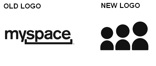
 Just when you thought Myspace was gone forever, it’s back in the news and looks better than ever. Earlier this week, Myspace investor Justin Timberlake (yes,that Justin Timberlake) tweeted a video introduction to the new Myspace, which you can watch below. Gone is the terrible logo that replaced an icon of people with a line in 2010. The new logo re-introduces Myspace as a brand focused on people and relationships. It’s simple and nostalgic.
The new design of the Myspace website and user experience is sleek, image-heavy, streamlined, and less clunky than Facebook. The question is whether the redesign, combined with the reach of Justin Timberlake, can convince people to return to Myspace or try it for the first time now that they’ve gotten a taste of social networking on Facebook.
There is no denying the fact that many Facebook members are not happy with recent site redesigns, advertising, intrusive apps, and a lack of privacy. This is business, and there is always room for competition. If the new Myspace meets the wants and needs of consumers who are tired of the Facebook experience, the site stands a chance to carve out some market share.
Interestingly, the new Myspace connects with Twitter and Facebook, as you can see in the introduction video. In that regard, Myspace isn’t trying to compete directly against the biggest social sites but rather trying to complement those sites. Is there room for another player in this market? Early buzz based on this quiet pre-launch video is positive, but there are still detractors who view Myspace as operating from a position of desperation rather than innovation.
I’m still rooting for Myspace. I hate to see a powerful brand deteriorate. I have hope for the Myspace repositioning but only time will tell if consumers buy into it. What do you think?
Lucy is Editor at Corporate Eye